Jessica N.'s Blog
Monday, June 1, 2015
Scratch Board
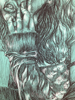
I did a self portrait for my scratch board. I chose this picture because of the light in the glasses, and the hair. The glasses had a cool reflection, and the hair had a lot of movement and texture. I could've done a better job showing the reflection in the glasses. I left it way too dark in certain spots. The hair showed a lot of movement so that was fun to draw. I think the hardest thing about this was that the tool I scratched it with would sometimes not work the way I wanted it too. It would get stuck in certain spots and end up making weird marks. It was kind of frustrating, but it was still fun. It was a lot like drawing with pen, which I really enjoy. It was a challenge because you couldn't erase or cover up your mistakes, you just had to keep on adding lines and hope it looked okay. Overall I think I need to get better at showing values and transitions, but I think it was ok for my first attempt.
Sunday, May 31, 2015
Art 3: 4th quarter
I finished up my time project. Each square represents how I felt when I painted it. I really liked this project because it shows how much change a person can undergo in just a day. It's kind of weird for me to look at because I did it so long ago, but I can vaguely remember the way each one felt. I think visually representing your emotions in an abstract way is good for you. It's kind of therapeutic in a way, and I think it's a better way of portraying emotion. It's not just simple symbols like a smiley face for happy or a tear drop for sad, emotions are complex things and are better represented with abstract images. Reducing emotions to simple images erases the subtle differences in the happiness you felt yesterday and the happiness you feel now. You may describe yourself as happy in both situations, but you know that it's slightly different than how it felt before. Or at least it does to me. I think I wanna do another project like this again in my free time, because it helped me learn a lot about myself, but I probably won't because I'm really lazy.
This is a quick sketch I did in prisma. I was experimenting with colors and challenging poses. The upper body looks weird, but the right leg looks really good to me.
I did a lot of bad self portraits. I got better as I kept doing them, but they never quite look like me. I guess that's something I have to keep working on. I'll probably do a lot more self portraits in the future because whenever I ask someone else to be my model they freeze up and just stare at the camera awkwardly. It's a struggle :/
When I don't feel like drawing myself and can't find a good model I find pictures of celebrities. They usually never end up looking like who I drew so I pretend that it was just some person I made up in my head :) This one kind of looks like who I was drawing though, and it's Twiggy. I didn't finish it , but I will eventually. I did it with oil pastels, which I discovered that I love this semester. I use to stay away from them, but they're actually really fun!
These are some of my prints. I really hated them when I made them, but they're not that bad. I'm sure I could've done a better job, but I still think they look kind of cool (even if you can barely tell they're hands).
Then out of frustration I made these ugly eye prints. I wanted them to look creepy, like a bunch of eyes were staying at you but they just look kind of stupid. I'm really sorry that I wasted that rubber stuff on this trash.
This is my still life. My original plan was to paint the class in front of me, but I realized that would be too challenging because people move around too much. I settled on doing those fake flowers that just sit in the room. I decided to make it as colorful and weird as I could, but I think it ended up way too busy. I still really like the background and basket, but I could probably redo the flowers. It looks a lot better in the photo, but in real life it's a mess.
Teens Inspired
For my teens inspired project I came up with the idea of sculpting women in unflattering poses. I noticed that when I went to the museum that women were a popular subject matter for sculptures. All of their poses were very poised and graceful. You obviously would never see someone positioned like that in real life. I thought it would be fun to sculpt women more relaxed, like they're the classical sculptures but they're on break. It was also influenced a little by Degas because he would paint ballerinas unposed, and I just thought they ended up really pretty anyway. The clay dried to fast so I didn't get them as smooth and detailed as I would have liked. They also didn't end up getting fired because the kiln got messed up, but it was fun to do them anyway. Sculpting is really hard, so props to anyone who can do it well.
I also did a few sketches and paintings of classical sculptures.
Thursday, May 28, 2015
Self Portrait
This is my self portrait, it's very big. I think it's 24 by 18 inches. It was really challenging because I was more likely to mess it up because of its size, but I think it paid off. I was able to add more details than I would have if it was smaller. It was kind of annoying though because I thought I would be done with one part and then I would look at it the next day and realize that it didn't show enough value. It was also challenging to redo an area because I had to worry about smudging the charcoal in other spots I had also done. I had to hold the pencil kind of weird so I wouldn't put my hand on the paper.
I feel like I learned a lot by doing this. I improved at drawing faces and using charcoal. Charcoal has become my new favorite medium because of this class. I love the way it looks on colored paper, and it really allows me to showcase my style. I can get really dark and show more movement with charcoal than I ever could with pencil. It was my first time doing a drawing this large, and I'd really like to do it again. I didn't realize that there was such a big difference in drawing large pieces compared to normal size pieces. It's not like you're just moving your arm, you have to get up and move around at certain points. I even had to stand up on my seat a few times to see the drawing all together. I also learned that it's a lot easier for parts of the drawing to fade into each other. I had to add a little pink to the eyes so they would pop out more, although it's not very noticeable.
It might've been hard to do this piece, but I really like it. I like the compositor a lot, and surprisingly I really like the texture of the hair. The lips are what really make it for me though. I think pulling at my face made them look really cool, and it was also fun to draw the skin that way. The color of the paper adds a lot to it too and I'm really happy with it.
Wednesday, May 13, 2015
Opacity drawing
Opacity Drawing
By Jessica Nastasi
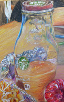
This took soooooooooooooooo long to do, but I really loved the way it turned out. It's a drawing of my lunch. I did it with prisma colors and I think they really helped me show the transparency. This was really fun to color because of all the different textures and colors. My favorite parts are the top of the glass and the little part of the bag that's empty at the top. I got to use a lot of colors for both, and I really love they way they look. The only parts I don't are some of the white parts on the bag because they don't look real enough, and the background. I might go back and fix the background later, but for now I'm 100% done working on this.
Sunday, April 19, 2015
Smartie and Dum Dum
If you showed these two pieces to a random person I don't think they would ever guess they were done by the same person. I'm so proud of how the dum dum turned out (besides the writing on it), and am so disappointed in the smartie.
I think the hardest thing about the smartie was that you couldn't do fine details easily with the chalk pastels. I've always had a pretty tough time with chalk pastels. I think chalk pastels look best when it's very smooth and soft, but my style is more rough and messy. I probably should've tried to be more soft than usual, but i was curious to see how it would work out. It didn't end up super horrible, but I think it would've improved a lot if I just gave in and drew less stylistically for once.
I'm so happy with how the dum dum looks! I told myself when I first started working on it that I wouldn't use weird colors like I always do and I would try to make it look as real as possible. Obviously I went back on my word, but I like the transition from more realistic to less. I think it looks really nice. I love prismas so much and I'm so happy I got to work with more than just the usual 12 color set I have at home. I need to start saving up money and buy one of those giant sets because you can do so many amazing things with them. The biggest problem I had with the dum dum was the words on the wrapper. Next time I draw words I'll make sure I sketch the out beforehand! I don't know why I didn't it. I just did the outline of the wrapper and its wrinkles and thought that would be good enough, but obviously i was wrong. I still love it though and I can't wait to do more prisma drawings.
Eggs
These are my eggs. You might not be able to tell that they're eggs because the assignment was to color them with weird colors. And also I just didn't do that great of a job lol.
I don't know why I have a problem with such basic things, but I can excel at more difficult things. It's kind of funny, but also frustrating. The egg on the table isn't that bad, but the egg in the cup looks too long, and not rounded enough at certain parts. The shadows are also pretty bad; they just look like they don't belong. I do think that I chose really pretty colors though and they almost make up for the weird egg. Also the lighting ended up really interesting, and it was pretty fun to find the different values with abnormal colors.
Subscribe to:
Comments (Atom)


.jpg)
.jpg)