Thursday, December 12, 2013

Eighth day of photoshop

(If you don't get what I was trying to do, here's a video.)

Wednesday, December 11, 2013

Sunday, December 8, 2013


Jean Kirschtein
By Jessica Nastasi 
Period 2, Art 2

When we were first informed about the concept for this project my mind went in so many different directions. There were so many cool things I could have done, and when I had just about settled on tin foil I thought of it. Denim. I had never heard of someone making art out of denim before, so I googled it. Turns out it's a real thing. The artwork was so beautiful it made me want to make my own.


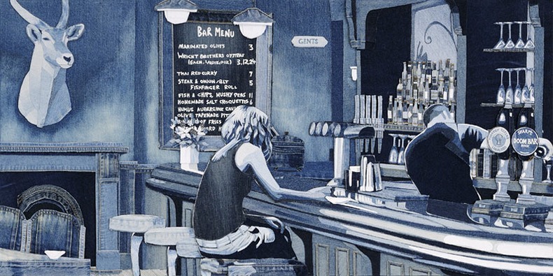
(These two were my favorites)

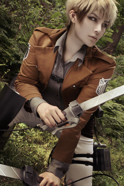
After I decided on my medium I started coming up with ideas for the person. My top choices were Marilyn Monroe, because her real name is Norma Jean, Jean Simmons, and  Jean Kirschtein. I thought the first two were cute because there names went with the medium, but I don't really have a connection with either.Jean K. was the one I  wanted to do the most, but my problem with him was that he's a character from an anime called Attack on Titan. And at the time I thought it might be weird to use him for that reason. I was going to go with Marilyn Monroe, but then I saw another person chose her. Some of the people at my table said I should just go with the Jean K. idea instead, and that's what I ended up doing.

I used this picture of someone dressed up as him to create it.


After I traced that onto a piece of paper I sat down, got out my materials, and realized I had no idea how I was going to do this. After testing out a few different techniques I figured out the best way to do it was to cut out a piece of the paper, trace that shape onto the fabric, cut the fabric out, and repeat. It took up a long time, but it wasn't a difficult thing to do so it was kind of nice.

I think out off all the projects we have done so far I have grown the most because of this one. My abilities may have only grown in fabric cutting, but I think my mentality on art has flourished. I'm no longer going to debate in my head for days what I will do on a project. I'm going to try new things, and really challenge myself. I might screw up, but I'm a high school art student. I'll have plenty of time to get better in the future. I'm looking forward to making new projects, and I hope you look forward to seeing them.

Tuesday, December 3, 2013

Second day of Photoshop
Peeta Mellark's true identity is a pita. 


First day of photoshop

Disney with the Warner brother's logos colors.

Tuesday, November 26, 2013


Naked Mole Rap 
By Jessica Nastasi  
Period 4, Computer Art Class

I made this animation by getting a picture of a naked mole rat, and photoshopping lips onto it. Each lip is in a different position your mouth would make while talking. Then I matched up the pictures, and the words in the song in flash.  

Tuesday, November 12, 2013

Monday, November 4, 2013

Sparkle Portraits
By Jessica Nastasi  
Period 4, Computer Art Class


Friday, October 25, 2013

Flower Brush
By Jessica Nastasi 
Period 4, Computer Art Class


Bonus: David Tennant


Thursday, October 24, 2013


Dude, you got it all over! 
By Jessica Nastasi 
Period 2, Art 2
This is my "Sticky situation" project. I came up with this idea because I thought about when you spill something like juice, or soda it makes things all sticky. I used acrylic paint, and melted crayons. I think using melted crayons was "thinking outside of the box"  I created repetition with the cups in the photo. I think the mini lessons were good practice, and also helped with deciding which kind of paint is suited best for me. 


This is a picture I took while  I was melting the crayons. The way I did it was I glued crayons down to the canvas after I painted it, and melted them with a hair dryer. 


Girl 
By Jessica Nastasi 
Period 4, Computer Art Class

How I made this was I drew it in photoshop, and colored it in illustrator. Then I added the shapes in illustrator as well. I'm not a big fan of illustrator. I think I could have done a much better job coloring it in photoshop. The only thing I like in illustrator is how easy it is to make shapes, and how when you use the bucket tool it doesn't leave a little ring of the color the object use to be like in photoshop.

I think the program would be really good for minimalist, but that's not really my style.

Monday, October 21, 2013

Lady Bugs
By Jessica Nastasi 
Period 4, Computer Art Class

Friday, October 18, 2013

2D Icons
By Jessica Nastasi 
Period 4, Computer Art Class

Thursday, October 17, 2013

3D Logos
By Jessica Nastasi 
Period 4, Computer Art Class

Tuesday, October 15, 2013

Rubber Ducky
By Jessica Nastasi 
Period 4, Computer Art Class
Flowers
By Jessica Nastasi 
Period 4, Computer Art Class

Monday, October 7, 2013


Cinemagraphs
By Jessica Nastasi
Period 4, Computer Art Class


Friday, October 4, 2013


Up Close and Personal 
By Jessica Nastasi
Period 2, Art 2


I came up with the idea for this because I thought people could get into a fight over getting a little too up close and personal. It's supposed to look like their are two groups of people going in different directions. The guy in the black shirt gets too close to the group going in the opposite direction and then bumps the guy in the hoodie.  He gets angry unusually angry about it and punches him. I also made it "up close and personal" by getting closer to the characters in each panel. I added emphasis by making the bystanders grey, and the people involved in the fight are colored. I also added emphasis by adding that little comic book thingy at the end. I don't know what it's called. 

Tuesday, October 1, 2013


Toon Magazine 
By Jessica Nastasi
Period 4, Computer Art Class

Friday, September 27, 2013

Light Aspect
By Jessica Nastasi
Period 4, Computer Art Class

Lady Gaga - Vogue Magazine Cover [United States] (March 2011)
1. The font is Baskerville Old Face, and is in a very large font. The color is black, and is place behind Lady Gaga's head. I think it looks nice, and makes her stand out.
2. There are 4 top stories. I think the font that they use might be Tahoma. The colors are black and pink. They use pink on the stories they obviously want you to read more. They text size also varies, but all of the top stories text are bigger than the sub stories. The biggest one is the page number for "spring fashion" they probably want you to go to that page the most because they're showing off clothes that they're selling. The placement is layered over Lady gaga, but not completely covering her. I think they did this because if they tried to keep the text from overlapping it would have been too small.
3.There are 3 sub stories. The font is all black, and the size is the same for all. It is probably Tahoma too. They are placed right under a top story. 

Welcome to NightVale text 
By Jessica Nastasi
Period 4, Computer Art class

Wednesday, September 25, 2013


Barbie Project 
By Jessica Nastasi
Period 4, Computer Art class

For my Barbie project I did Chris Hemsworth as Johnny Bravo, Ariana Grande as Jessica Rabbit, and Honey Boo Boo as Pinocchio. To make them look this way I used the liquify tool in photo shop. I also used hue/saturation, and color balance for the Honey Boo Boo one. That one is probably my favorite, because I think I did the best job on it, and it's funny in a creepy way.

Friday, September 20, 2013


Eye Color Change and Touching up
By Jessica Nastasi
Period 4, Computer Art class

I retouched this picture by cleaning up her skin, and changing the shade of her eye color. I used the patch tool, and spot healing brush for the skin. Then I put a Gaussian blur on it to make it look smoother. For the eyes I used edit in quick mask mode to select them. Then I changed the color with color balance and hue/saturation to change the color.

Before we started this unit I knew a lot of retouching was done to photos in magazines. I understand why the retouch photos in magazines, but I don't think all of the reasons are good. I get that in an advertisement the people who made it wouldn't want distracting features on there models, like stray hairs, or bad skin, to distract from the product. I don't really mind when they do stuff like that, but I do have a problem with them messing with the models body and making them look super skinny. I think it promotes the idea that beauty only comes in one size, and that's completely wrong. I'm not sure I will be able to notice and pick out every thing that's been retouched on a photo, but I'm sure I'll be able to notice big things like the skin.


Thursday, September 19, 2013


Touch Up
By Jessica Nastasi
Period 4, Computer Art class
Walk Cycle 
By Jessica Nastasi
Period 4, Computer Art class

So this was my animation for the walk cycle. As you can see I didn't do all to well. It ended up looking like it was walking backwards, it's actually kinda funny. The way I made it was I drew the character and repositioned its limbs in each panel. I guess I didn't pose it correctly and that's how it ended up that way.